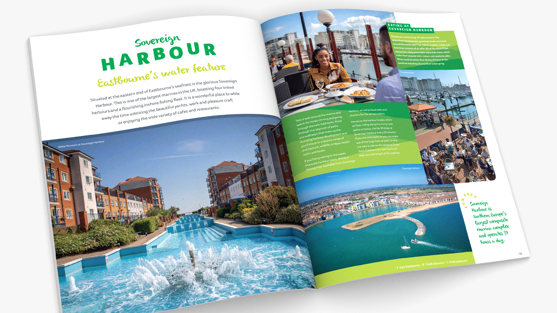
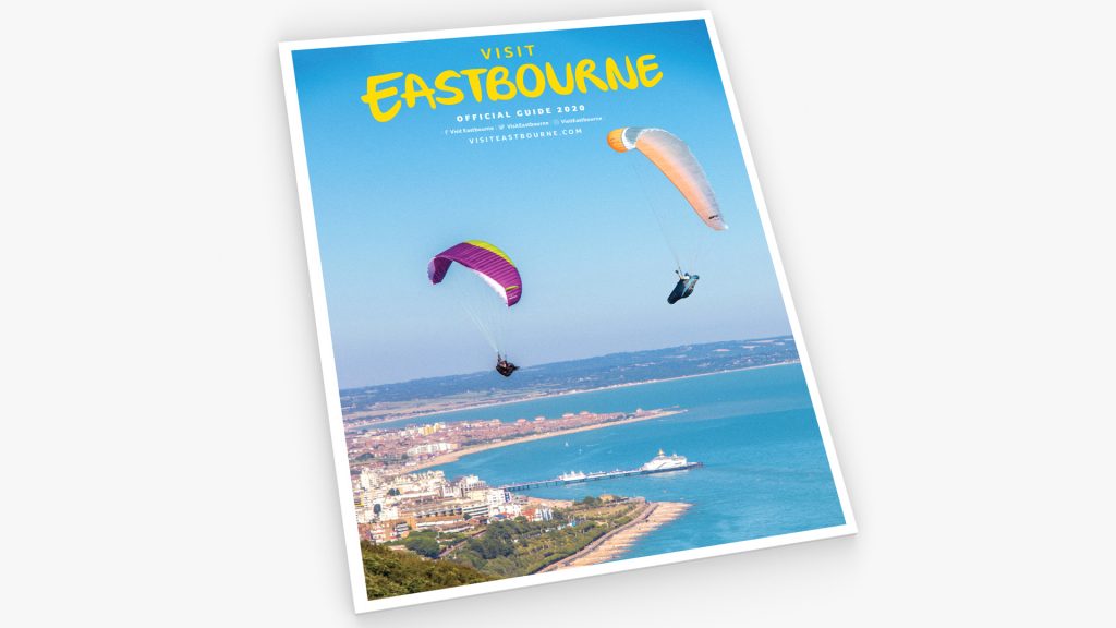
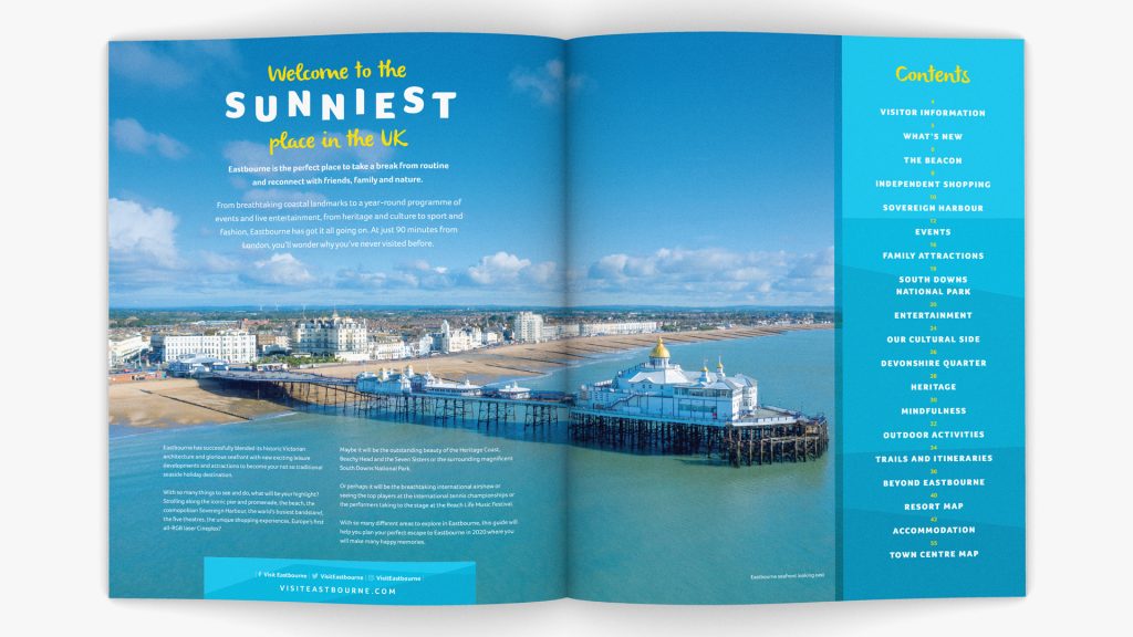
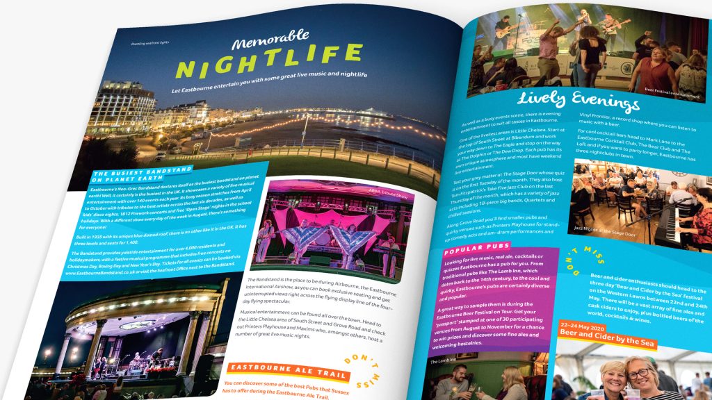
The official 2020 guide for Eastbourne (and beyond) was developed using the brand guidelines and tools already existing. However, we went for the fun side using their colourful ‘texture’ palettes cropped tight with multiple applications across each spread. Headlines ‘bounce’, images are large and it’s a very dip in approach to the content and less prose driven than previous guides. Who wouldn’t want to visit?
Snippets of further information are supplied with ‘Don’t miss’ and ‘Fun fact’ roundels allowing for cross-referencing within the Guide. The project is being followed up by a mini version which is just as colourful and bouncy! We commissioned the copywriting too with Miranda Rock at Rocket Launch!
Snippets of further information are supplied with ‘Don’t miss’ and ‘Fun fact’ roundels allowing for cross-referencing within the Guide. The project is being followed up by a mini version which is just as colourful and bouncy! We commissioned the copywriting too with Miranda Rock at Rocket Launch!


