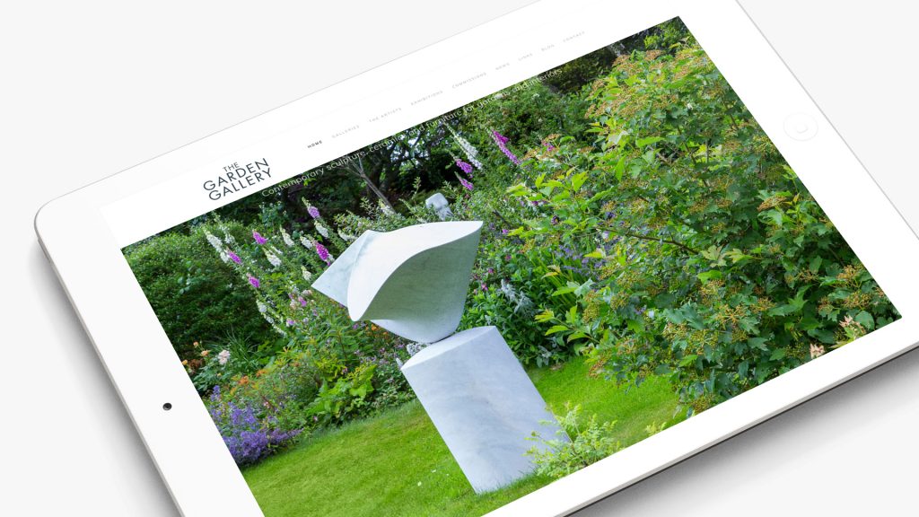
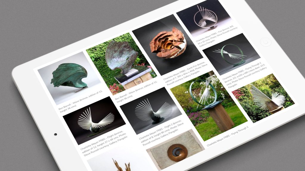
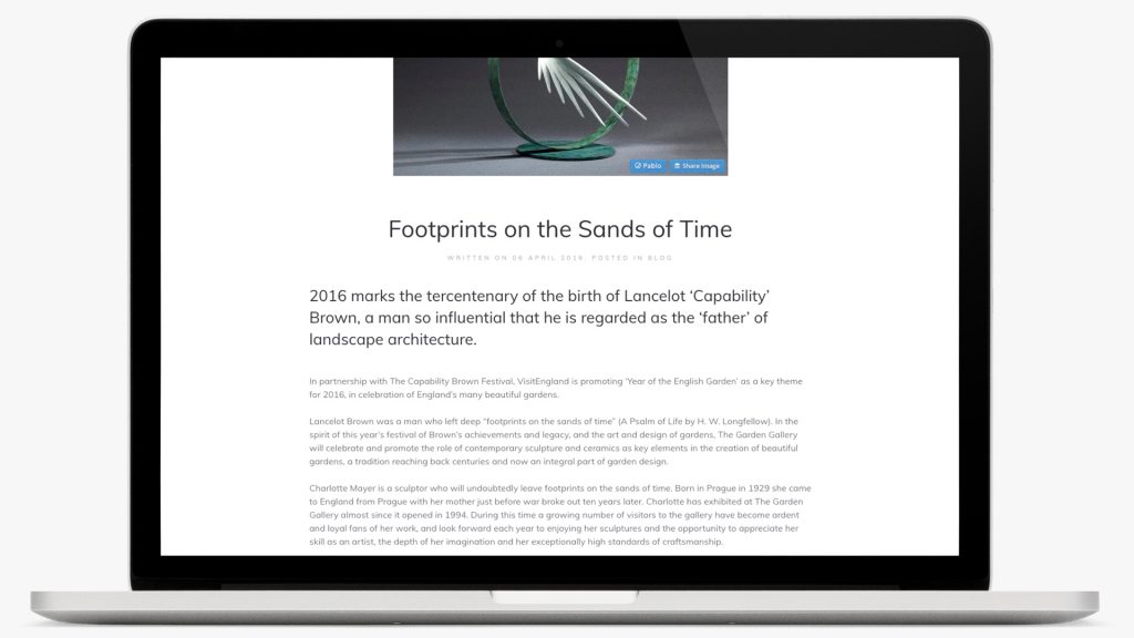
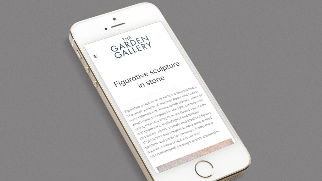
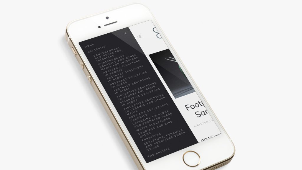
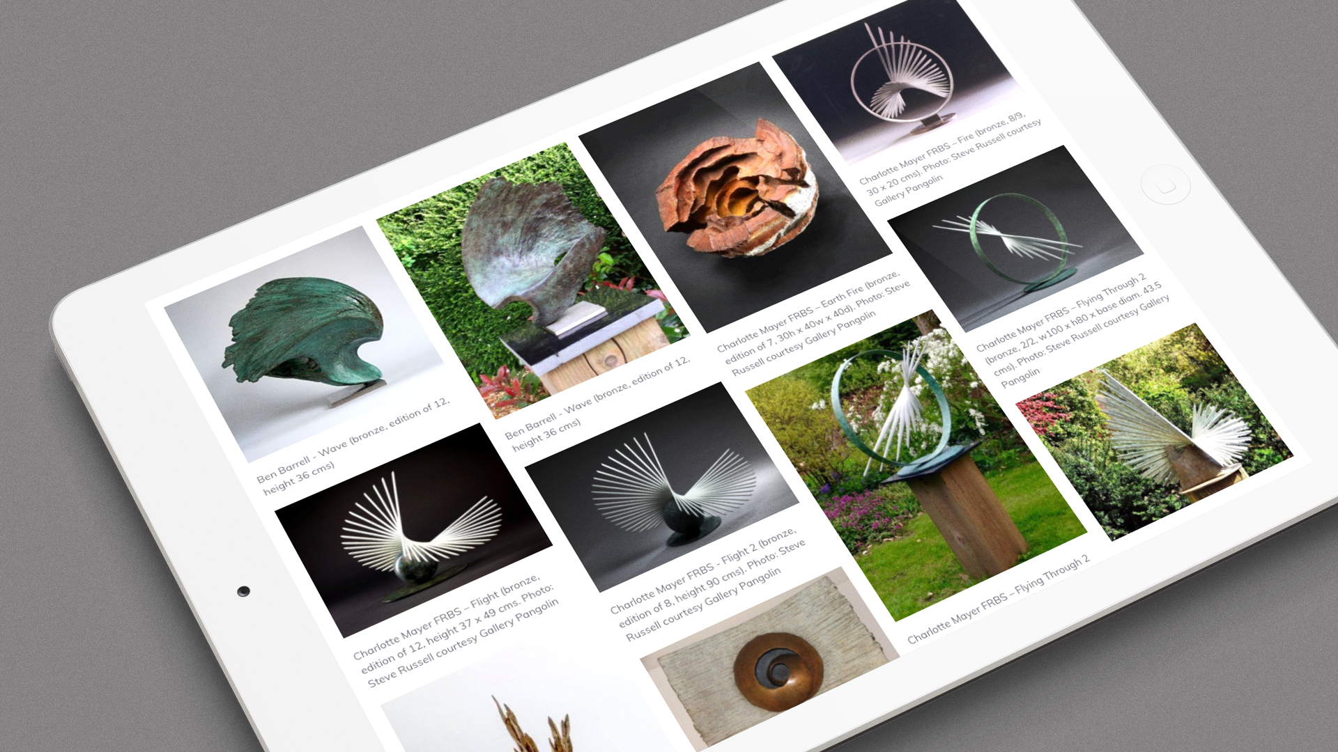
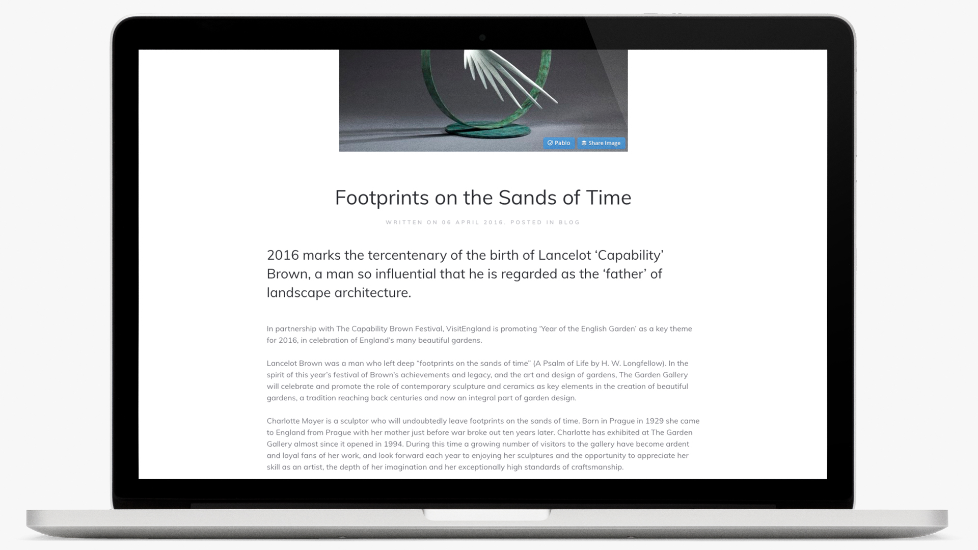
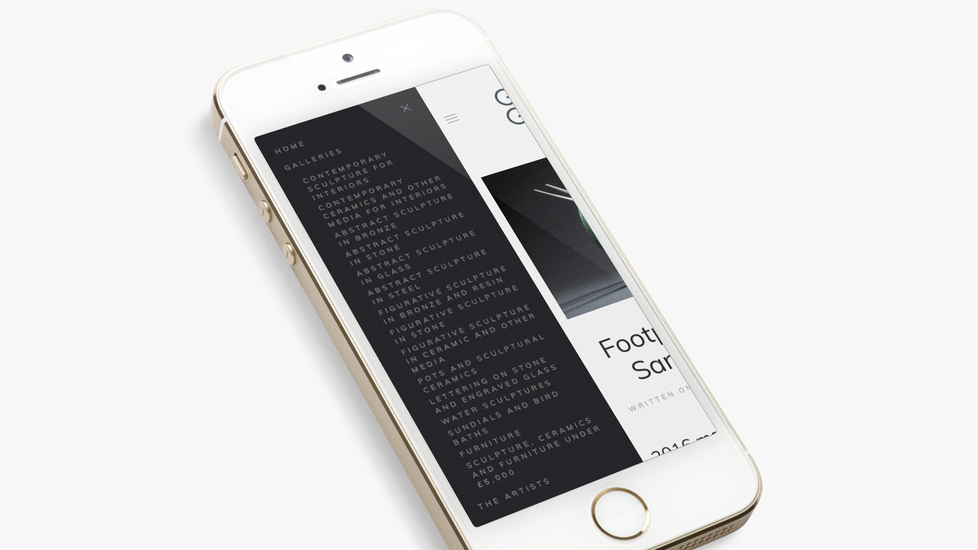
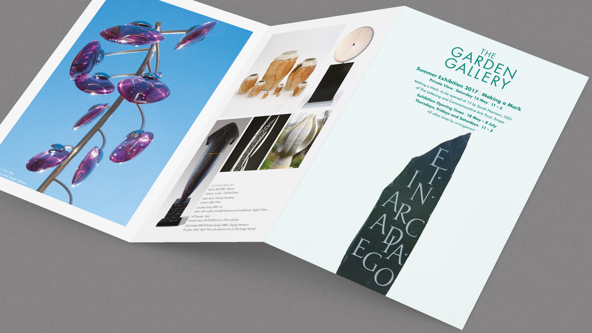
Almost uniquely, a gallery for garden sculptures in an actual garden. Following on from our redesign of their identity and printed material – and a photo shoot with Marianne Majerus – we began the task of designing the website. Full-screen photography on the home page devolved to ‘framed’ images on the following pages, particularly the gallery pages which have an impressive breadth of content with a smooth ‘build’ on opening. Navigation on the desktop is horizontal, and on mobile ‘swipes’ from the left – both methods allow for easy navigation throughout the site… nothing surprising, nothing over-designed, nothing getting in the way of the content.


As it happens, this is our first Joomla-environment website. As designer’s we are neutral on which is the best CMS to deploy, in this instance the client had a hosting relationship using Joomla which was to continue, but we have used WordPress (both custom themes and off-the-shelf themes), Ruby on Rails and, lately, have been using Squarespace which has a lot of attractions, particularly for start-ups. Where we can’t do it ourselves, we know a lot of people who can.
