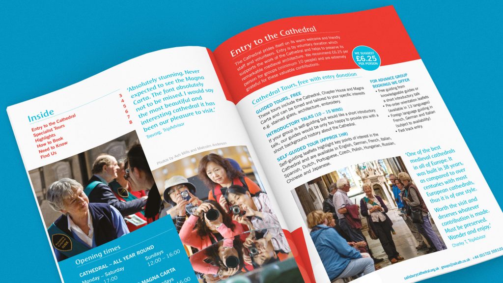
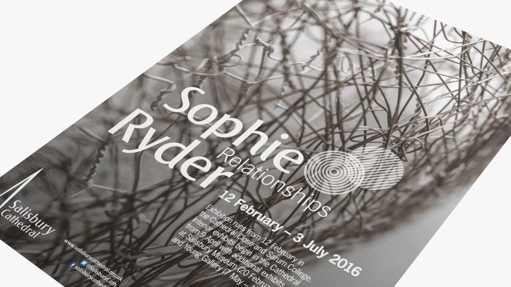
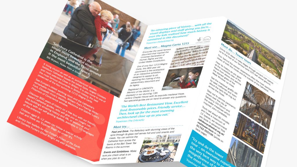
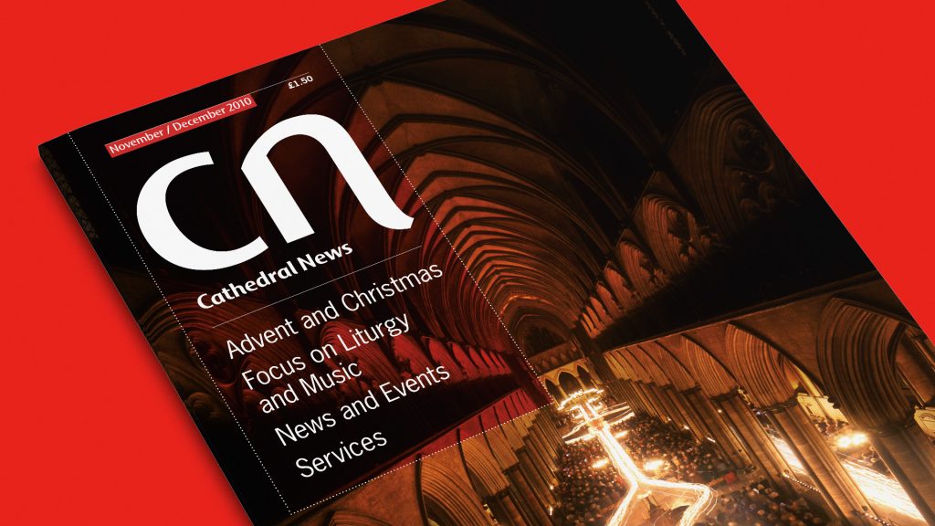
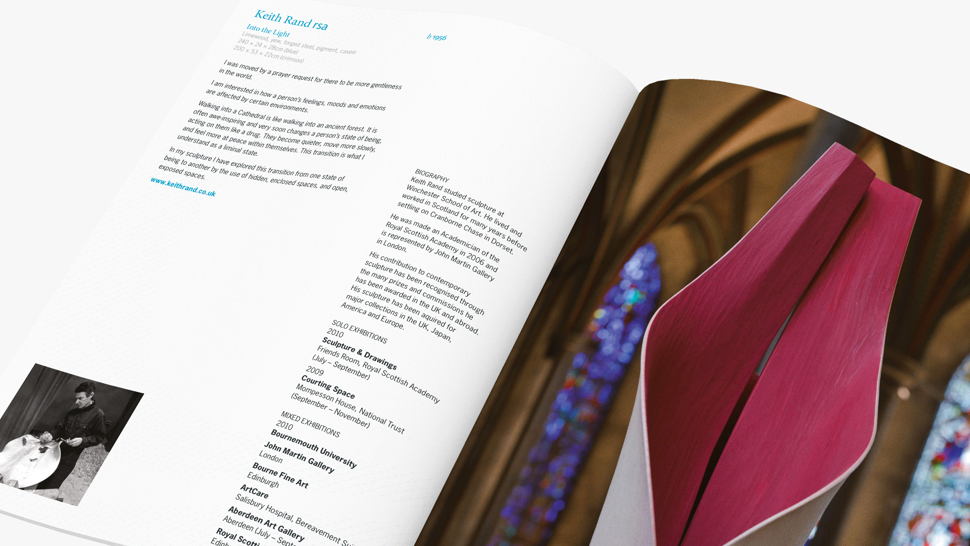
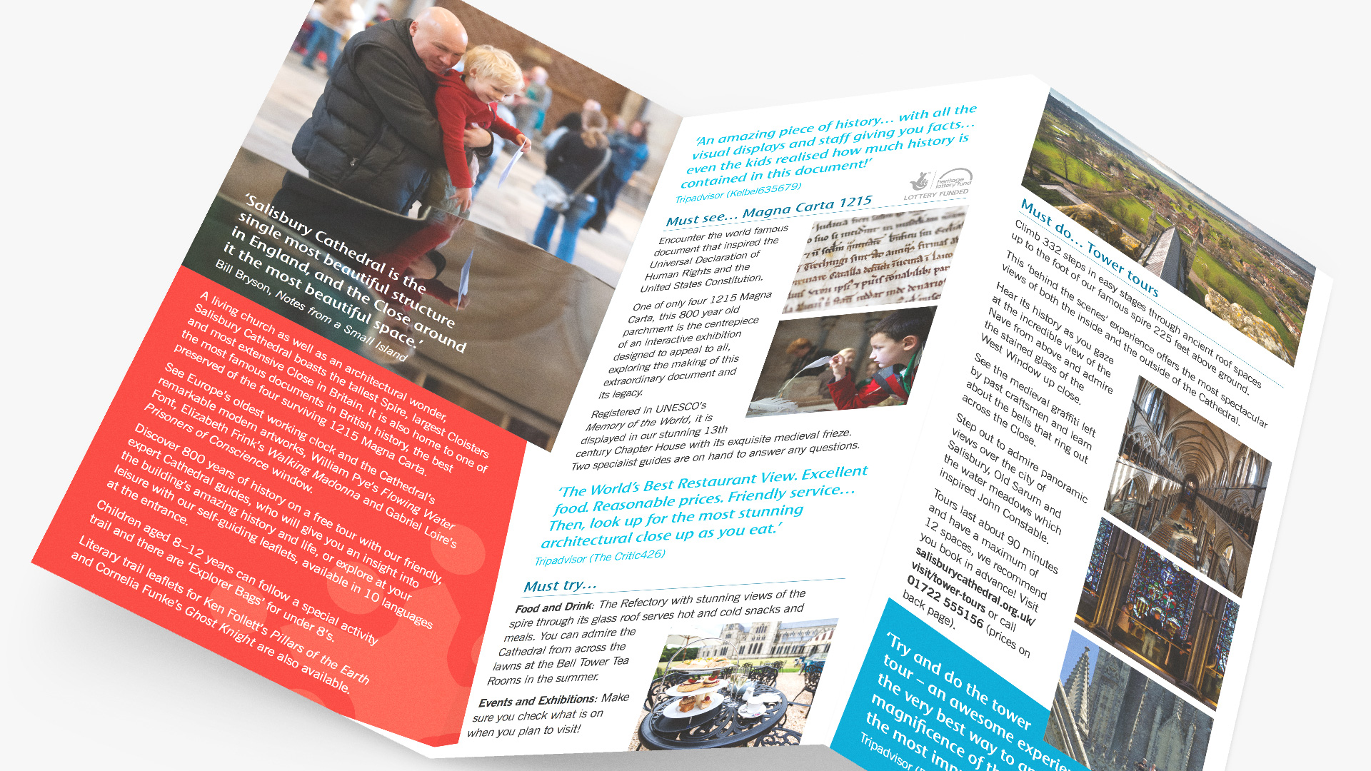
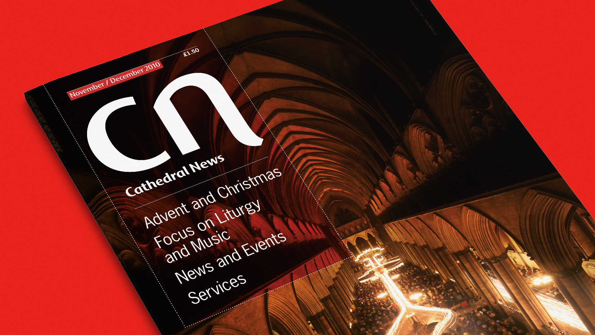
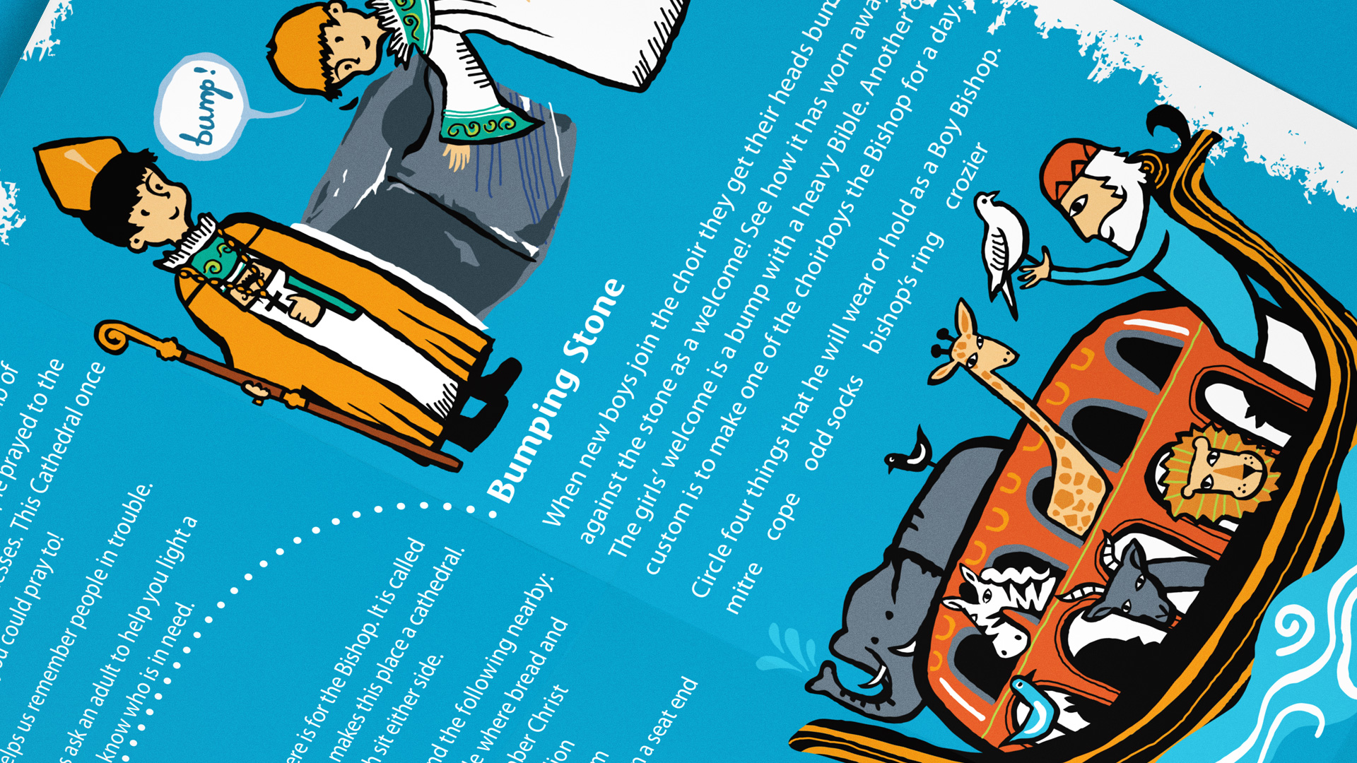
From developing newsletter templates to producing annual reports and establishing mini identities for each sculptural installation we continually push their brand guidelines to better represent the intended audience. For example, the visitor collateral utilises a bright blue and red from their extended palette in blocks of colour… originally angled to the same degree as the Cathedral steeple (not a lot of people know that!). The exhibition design takes a more subtle approach, whether as background ‘toolmarks’ or interpretations of how a sculptor works – all applied across interpretation print, posters and advertising. As for the children's activity sheets, we commissioned Peagreen to highlight some of the stories and areas of interest around the Cathedral, bright and colourful and, with everything else, visually inviting.
Salisbury Cathedral


David and Liz are a delight to work with, the perfect combination of wonderful creativity, real bend-over-backwards flexibility and excellent value. We genuinely enjoy working with them and know that we won’t get service that good anywhere else – and the output is fabulous.– David Coulthard, Marketing and Communications Director, Salisbury Cathedral (now at Chichester Cathedral)
